Datavisualization
The Research Centre for Datavisualization focuses on developing, evaluating, and implementing novel ways to interact with data and information. The improvement of the human ability to manage data, extract information, and gain knowledge from it is of vital importance for a society in digitization. Visualization is an effective way to enhance human capabilities to extract and interpret information and support human decision-making.
Furthermore, data-driven stories are increasingly getting a vital role in knowledge transfer and subsequent decision-making. As a result of the advancing digitalization and large-scale global developments such as climate change, the Covid 19 pandemic, and societal changes, there is an increasing need to communicate and disseminate quantitative data to diverse audiences. However, understanding the data itself and the contextual meaning poses a significant challenge in this context.
Within the human data interaction group, we focus on three research lines:
Storytelling
Though there are various instruments to explore data, techniques to annotate data, summarize it narratively, or employ storytelling are still relatively underdeveloped. Based on the exponential growth of global data, the ever-increasing availability, and the resulting need to use this data, it is essential to research, describe and publish methods that simplify the correct usage of data (understanding, background, assumptions, applicability, implications). There is a need to develop methods to summarize ‘narratives’. A core element thereof are methods to contextualize data.
Human Data Interaction
Due to digitization, the correct interpretation and communication of data are essential in more and more areas. Data visualization offers new opportunities to improve the accessibility of data and algorithms – in the exploration and presentation scenarios. In addition, new techniques and contexts such as virtual reality and augmented reality or multimodal interactions like audio and physical interactions enable us to interact with data in novel ways. Within this field of research, we investigate how new methods and contexts can enhance the interaction between people and data.
Data and Society
The amount of available data is ever-increasing. The politics of ‘open data’ promises more transparency and more democracy, especially concerning government and public services data. Currently, working with and understanding this data carries (too) high demands for large parts of the population. As a result of this, the opposite becomes true. Individuals or companies use and/or interpret the data for their own interests. ‘Open data’ can only achieve the intended goal when all individuals are provided with tools that help them to understand data that is interesting/relevant to them. Developing such tools for various audiences in cooperation with the partner institutions is an objective of the knowledge domain.
Nowadays, data can be collected and used in new contexts. It is tempting to assume that existing problems can be solved with this data. This may be partially true; however, “If you only have a hammer (data), everything appears to be a nail (the problem).” And so, a frequent occurrence is that only certain aspects (those which are covered by data and/or can be solved with data) are tackled. This subsequently leads to a dominance of statistical methods and a focus on the status quo at the expense of systematic approaches. It is vital to critically review and safeguard the role of data – particularly the role of data visualization – so that qualitative approaches – where needed – may flourish and be incorporated in the visualization.
The lector
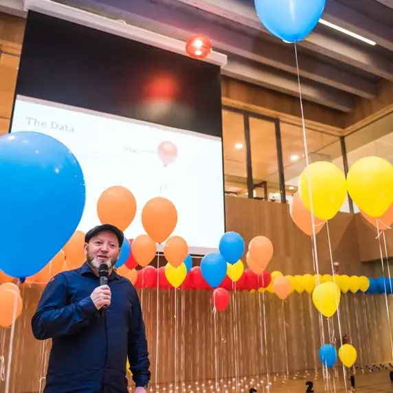
Kay Schröder has been the chair of the Research Centre for Data Visualization since March 2019. He presented his inaugural lecture on 14 February 2020 on the Brightlands Smart Services Campus. Kay Schröder holds multiple roles at different universities globally and is engaged with Zuyd University of Applied Sciences, Polytechnical University St. Petersburg, RWTH Aachen, Maastricht University, and University College Venlo; in different leadership, research, and teaching roles.
Kay Schröder has been working in the field of visualization for more than a decade now. He worked several years for the Climate Programme of the United Nations (IPCC) and developed the visualization concepts for the world climate reports. Furthermore, he developed numerous national and international projects on the intersection of technology and sophisticated design for Reed Elsevier, Gruner & Jahr, Lexis Nexis, the Belgian Pavilion on the Expo Shanghai and others.

More information
More information about this research centre can be found on www.hdilab.com
Human Data Interaction Lab
Brightlands Smart Services Campus
Smedestraat 2
NL-6411 CR Heerlen